
About the Artist: Emily Edelman
Emily Edelman is a New York native and a graduate of the Rhode Island School of Design (RISD), where she earned her Bachelor of Fine Arts degree in Graphic Design. Today, she is an accomplished artist, designer, and curator living and working in New York City.
Emily Edelman is an artist exploring the intricacies of text, typography, scale, and color theory through her innovative generative algorithms and unique digital practices. With a classically trained eye and a taste for quiet complexity, her work examines the thin line between legibility and abstraction within the rich and timeless realm of letterforms and visual communication. Her innovative practices consistently pushes the boundaries of digital creativity while remaining rooted in traditional craftsmanship
Across digital media, Edelman has already shown prolific output. Recent releases include: Twos and Asemica on Artblocks as well as Monospatial on Prohibition and Martin on Verse. Following the success of these projects, her forthcoming release, Covenant, will mark her anticipated SuperRare debut.
In addition to her artistic practice Emily has become a prominent community builder, having co-foundedToken Art NYC alongside Steve Pikelny and Alex Supkay. This conference has played a pivotal role in shaping dialogue within the digital art community, offering a platform for artists to exchange ideas, share experiences, and support each other.
Emily’s work has been shown internationally with ArtBlocks, Bright Moments, Verse Works, Artsy, and VellumLA.
About the work:
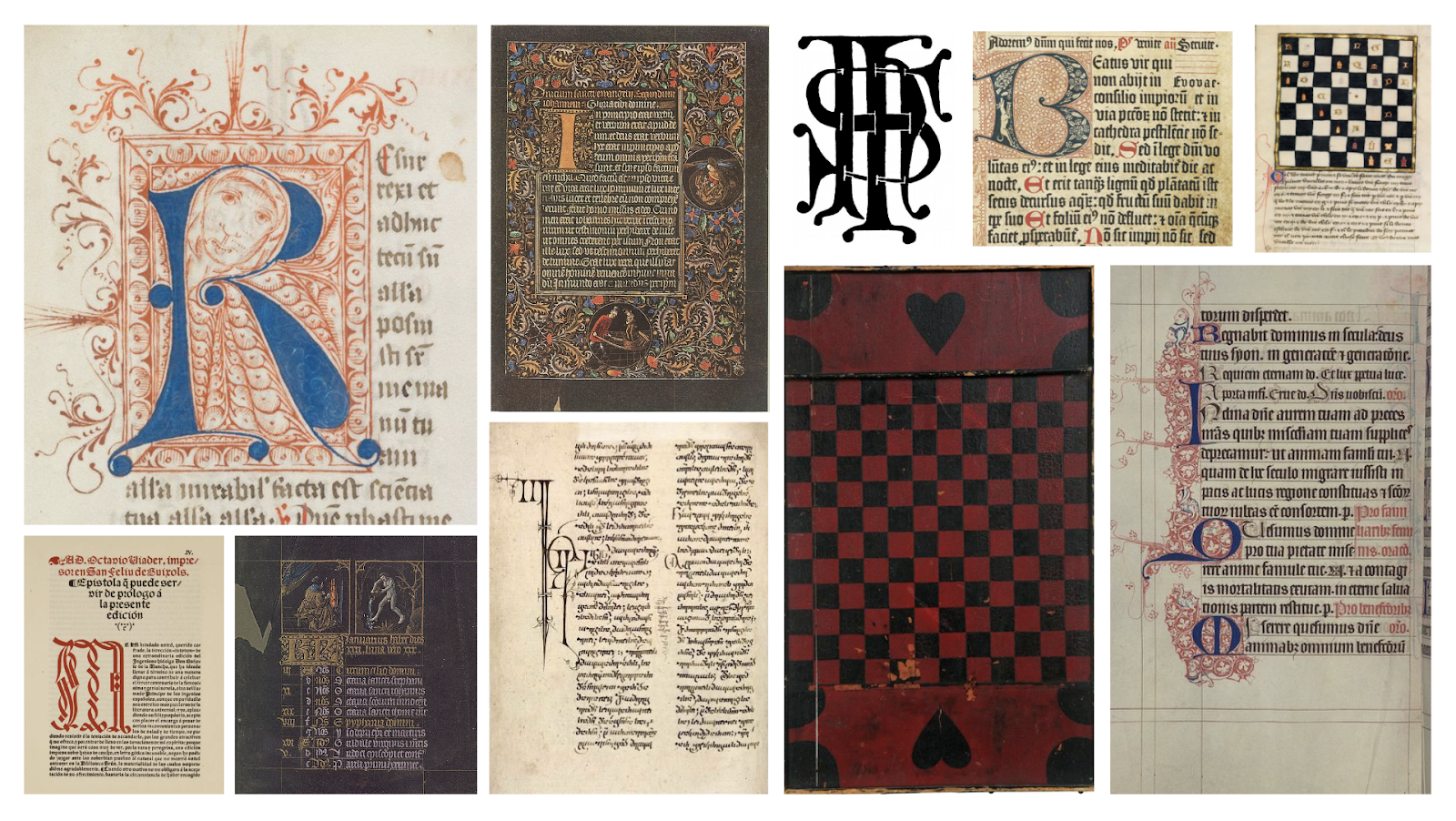
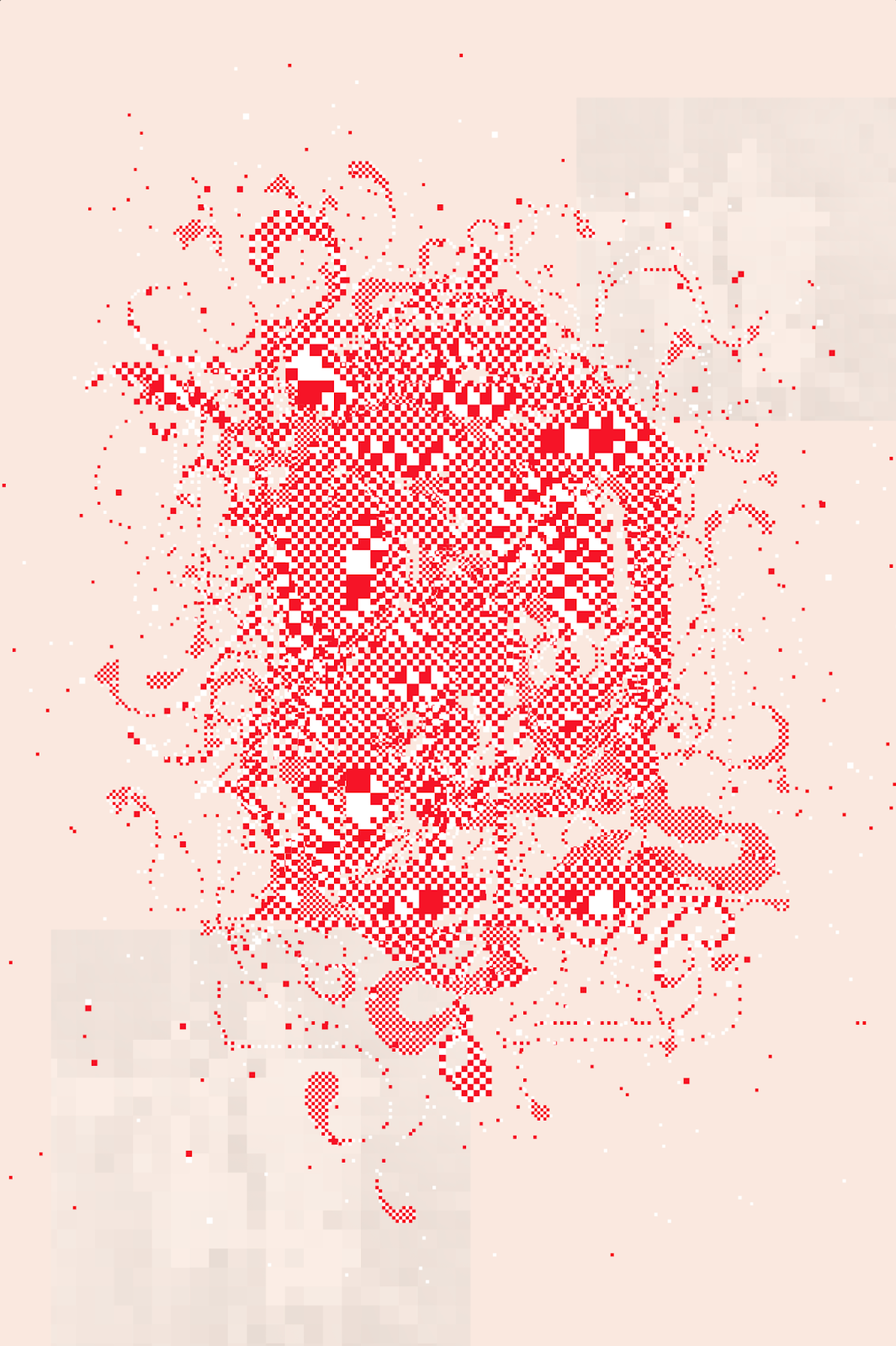
Inspired by the illuminated manuscripts of the Middle Ages, Covenant presents a novel approach to handcrafted pixel art. This series invents intimate new letterforms by intertwining two uppercase letters. Created using a custom drawing tool specially programmed by the artist, these works appear ornate from a distance while carefully revealing their low-fidelity, checkerboard construction upon closer inspection.
The subject matter of this work references a time when scribes meticulously crafted letters by hand. The act of illustrating manuscripts elevated the text, serving as both a decorative and instructive complement to better guide the reader's understanding. In an era before the printing press and mechanical reproducibility, each tome was unique— a celebratory object that transcended mere legibility.
In this series titled Covenant, the artist's work echoes this tradition through her precise motions crafted with a mouse, a continuing exploration of the hand drawn nature of a manuscript’s illuminated letters. The compositions thus serve as an exploration of the past and present, nodding to a revival of medieval calligraphy through a digital media.
This series is part of Edelman's ongoing exploration of typography and lettering across cultures, technologies, and eras. Throughout history, text has persisted and adapted, swiftly inhabiting new media and capturing humanity's experiences across place and time.
The interview:
Paloma: Did you always want to be an artist growing up or when did you decide to pursue art?
Emily: During a tee-ball game, my 5-year-old self noticed a chair way out in the next field. I left my game mid-play to sit in that chair and make designs in the grass. I wanted to be an artist, then a designer, and then decided that the only difference is whether you’re creating for someone else’s constraints or not. I like both!
Paloma: How did your education at RISD influence your approach to art and design? What led you to pursue generative art specifically?
Emily:I chose to study graphic design because the program at RISD was conceptual rather than technical. It gave me a design-thinking foundation, applicable to any medium. In school, I used nontraditional materials to create posters and books, and then spent 10 years in event design and experiential storytelling - a designer more than an artist. Finding generative art was finding a medium with constraints that excited my design mind and allowed me to express for myself rather than clients.
I love the aspect of graphic design that involves finding the cleanest and still most interesting layout because it means obsessive iteration, a small learning in each trial to achieve the end result. This process of iteration is completely embodied by generative art and really any kind of series creation; the changes made from piece to piece are what tie it together and strengthen it; its iterative process is visible in the final outcome.
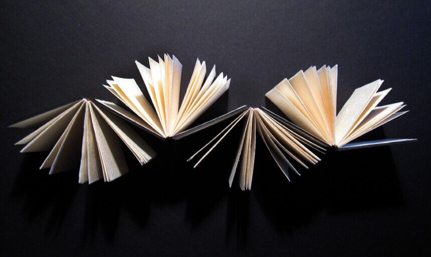
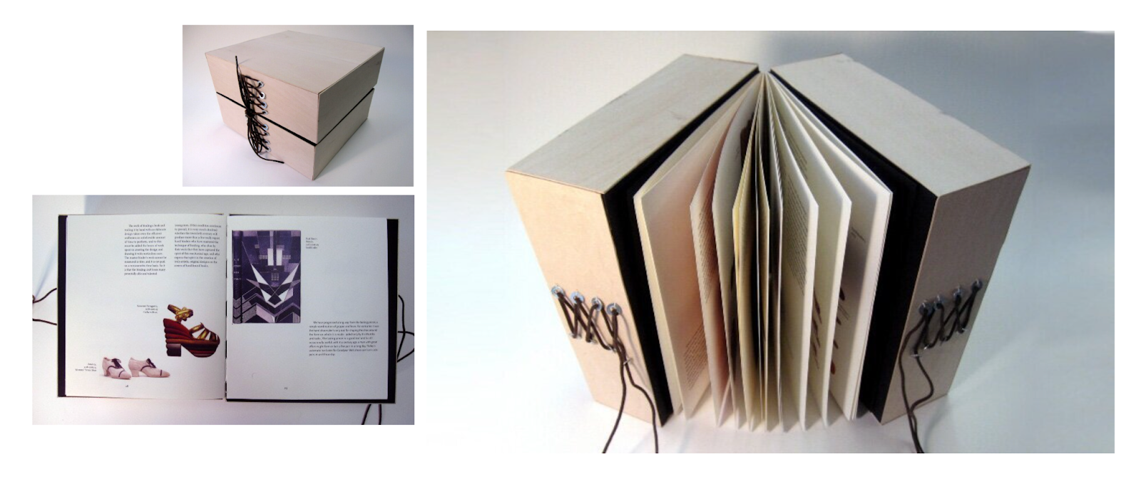
From Poetic Book Structures, 2012
Paloma: Your work often explores text, typography, and communication. What fascinates you about these themes, and how do they influence your artistic practice?
Emily:Text is one of the oldest human inventions. Across civilizations, the aesthetic possibilities of text are vast because of, or in spite of its constraints of form and legibility. Text is such a foundational point of connection for humanity.
The applications of text are broad: you, reader, are 100% within view of text not including these very written words (a clock, a poster, a book, a billboard). And beyond function, text can be communicative and expressive through its design: lettering and typography. That designed text can be so evocative — even without legibility or literacy — is endless inspiration.
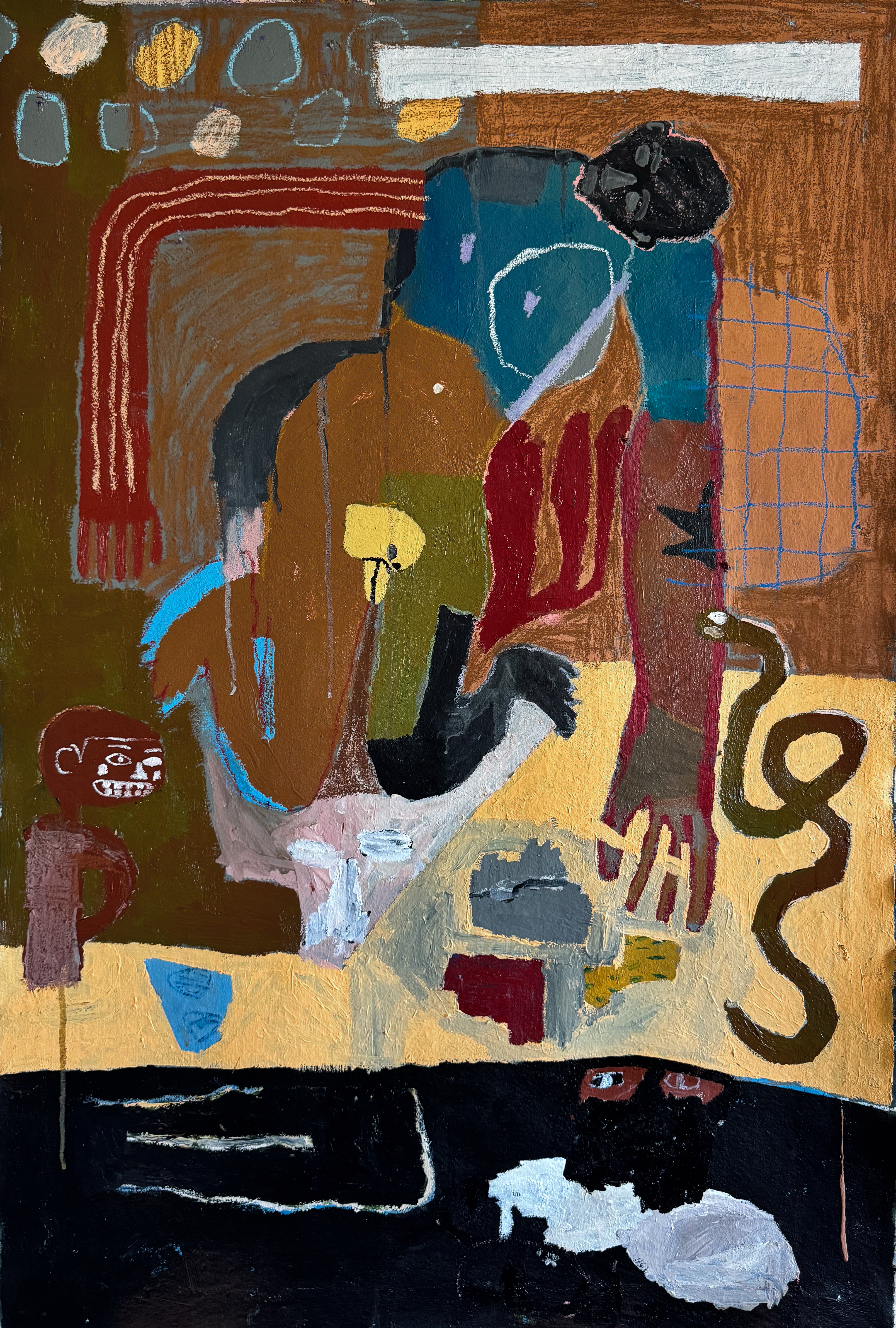
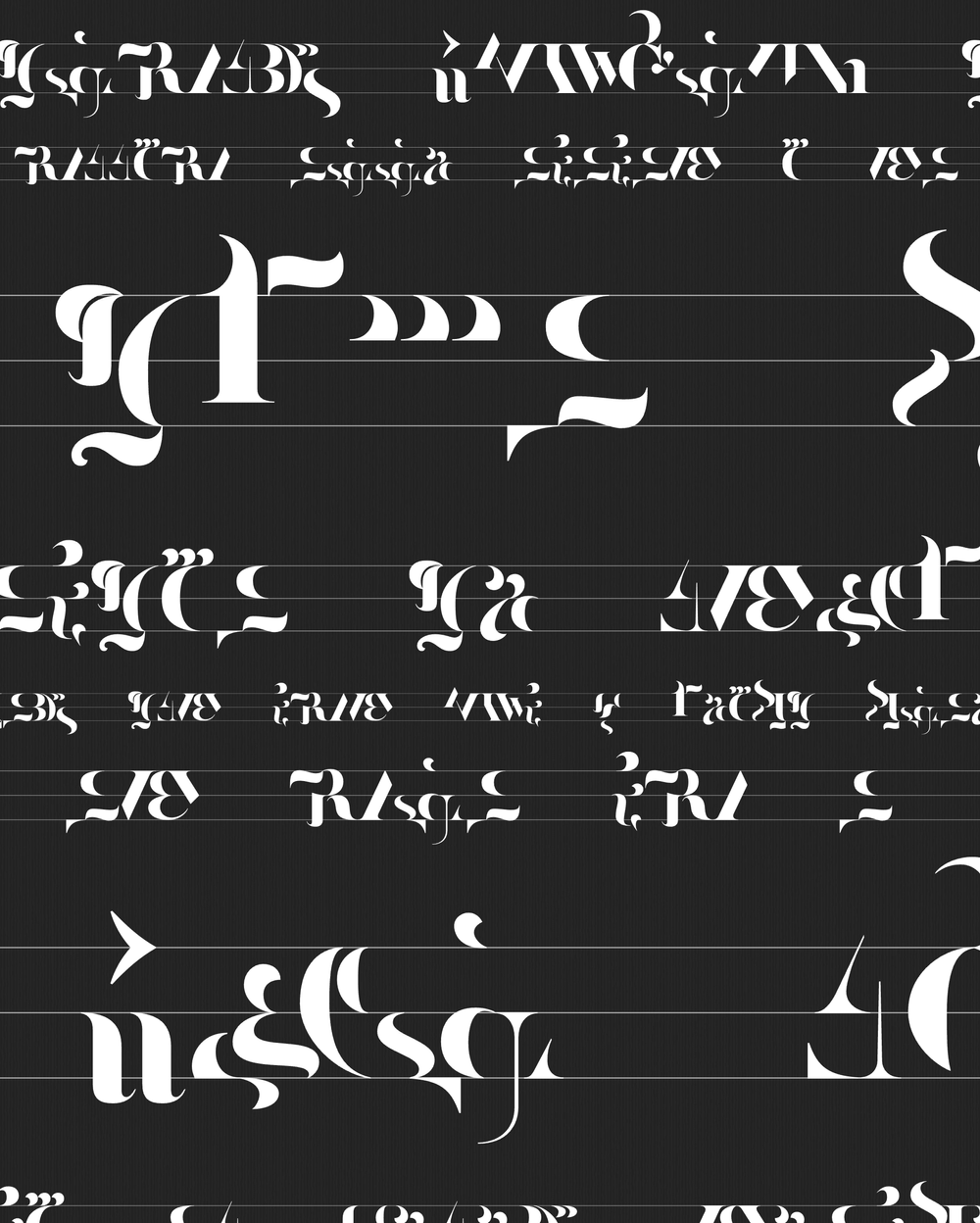
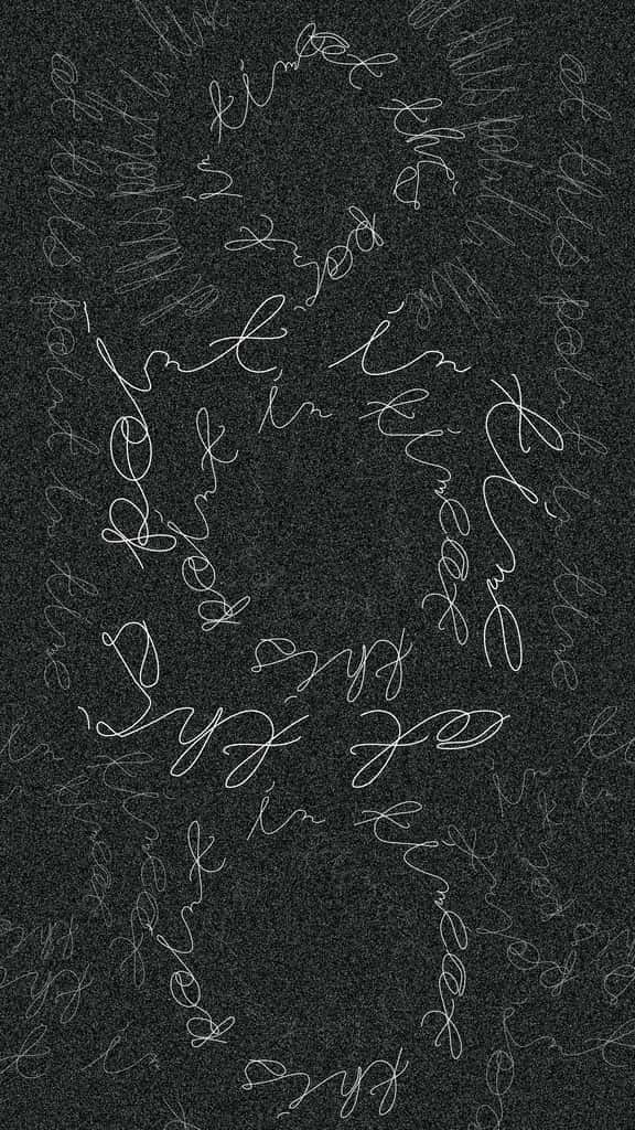
Legibility is a recurring theme in my work; in some cases, the letterforms themselves are invented, like an early project, Asemica. In Cosmico, handwritten English text is warped and wrapped around itself to become a hidden thing to discover, past the point of a first emotional reaction. In Monospatial, random letters sit together, tempting the viewer to find legible meaning in the familiarity of the forms.
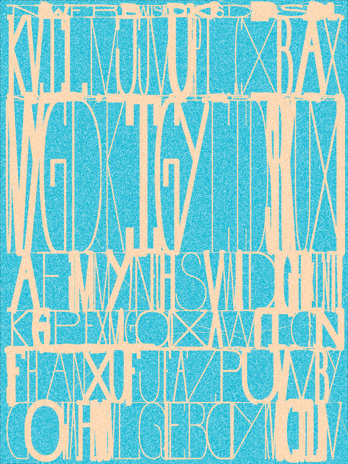
Asemica #192 - owned by Scott Byrd
Cosmico #13 - owned by Zeneca
Monspatial #65 - owned by Bryan Brinkman
Paloma: What initially drew you to the illuminated manuscripts of the Middle Ages as a source of inspiration for your latest series?
Emily: Illuminated manuscripts are handwritten text documents with heavily flourished illustrated letters, made beautiful for two reasons: so the illiterate could find meaning, and to elevate a document’s importance. Present in the inspiration is both the question of legibility and the kind of beautiful absurdity of a flourish, still functional in its ability to make text emotional.
The illustrated characters in Covenant are made by combining two uppercase letters, with all their flourish, to create a new hyper-illustrated glyph.
Paloma: What parallels do you find between the process of creating illuminated manuscripts and your work with digital tools?
Emily: When making works by hand, as opposed to with an automated tool, reproduction is often just as laborious as creating the original. Because illuminated manuscripts were made before there was automated reproduction, each became a work of art to behold in its uniqueness.
Rather than modern production tools making it easier to create, they’ve just expanded the possibilities. There might be the same level of care and attention to quality in making today as with illuminated manuscripts, despite “easier” technology. So when I create using digital tools, I sometimes feel like I am handcrafting, especially throughout the process for Covenant, in which I coded a custom pixel art drawing tool.
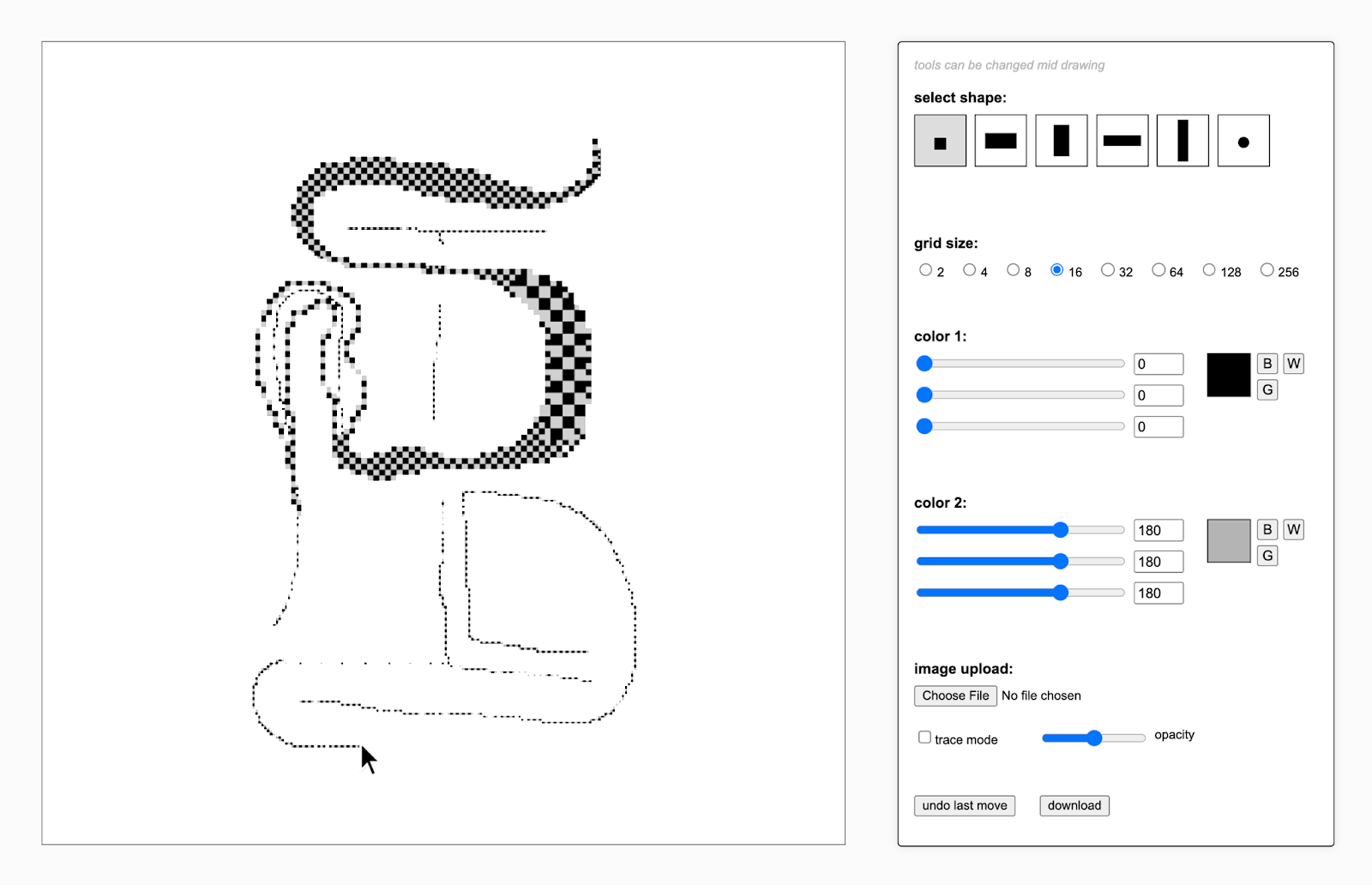
Custom coded checkerboard drawing tool
Paloma: Could you elaborate on the custom drawing tool you designed for this series titled Covenant? What was the development process like?
Emily: I’m drawn to pixel art because it represents the base physical module of the digital medium. I’m drawn to checkerboards because they are a version of pixel art where every individual pixel stands visibly apart from each of its neighbors. “Visible pixels” have been a recurring motif in my work, most often used on a small scale for a texture that evokes tactility but is actually digital in its pixelated makeup.

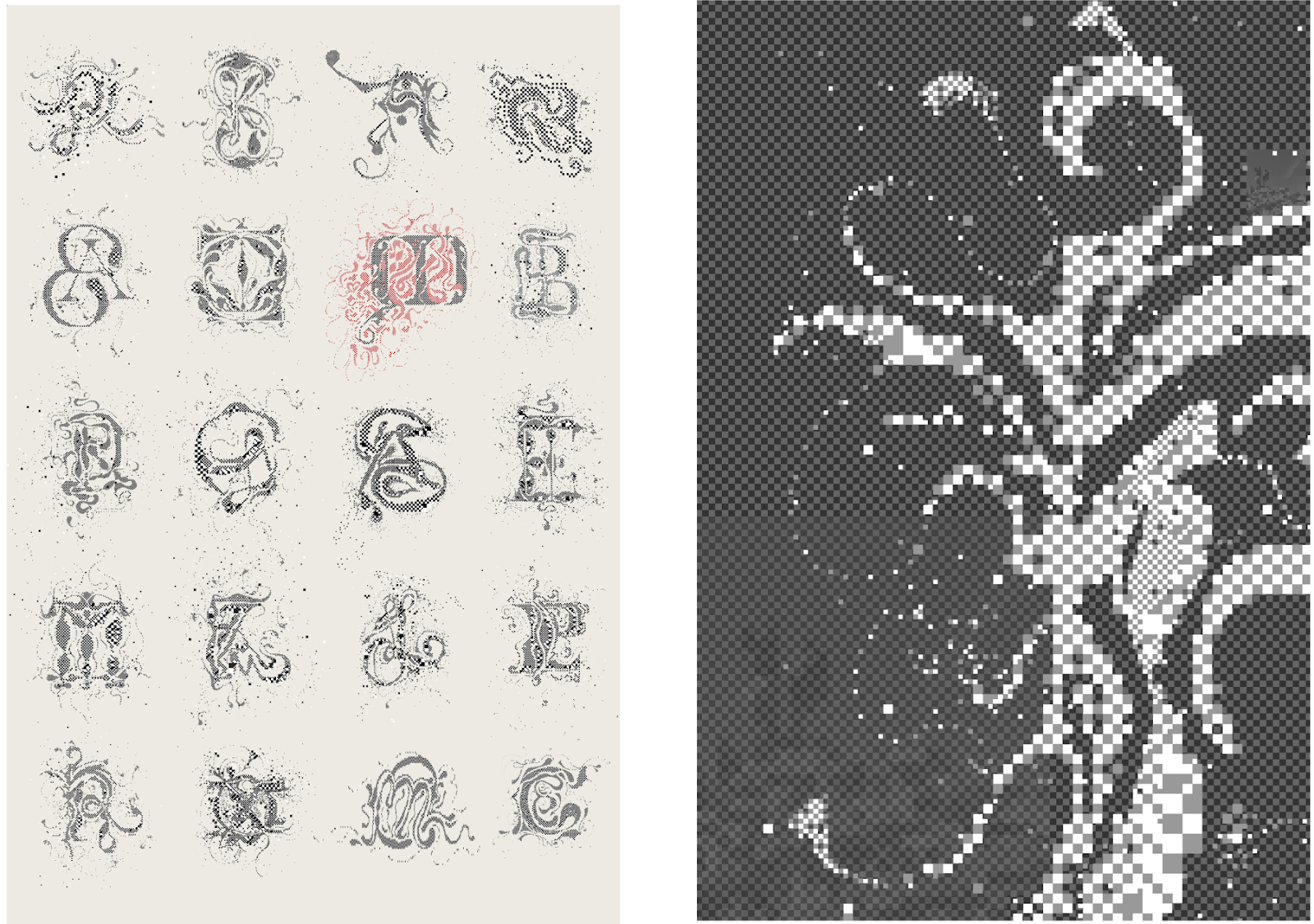
From Twos test output (left) Detail (right)
For Covenant, I envisioned ornate pixelated typography that would become almost illustrative. I needed a custom tool that would let me pick two colors and reveal bits of checkerboard with every careful move of the mouse.
The tool lets the user choose a module (square, various rectangles, circles), a module size, and colors, all of which can be changed mid-drawing. Each ascending grid size is twice the size of the previous, so that every “visible pixel” sits flush with those around it on a perfect grid, despite size changes.
I coded the tool in p5.js and worked with Anthropic’s Claude on some of the features.
Paloma: How does the checkerboard construction of your pixel art pieces add to the overall narrative and aesthetic of this series?
Emily: That the characters in Covenant are actually pixel art is central to the concept of the series; in thinking about what it means to hand-make in the digital age, pixels are a fitting module.
The vision for the project began with the seductive challenge of creating complex and old-looking glyphs with an obviously contemporary module, for a truly new aesthetic. - Emily Edelman
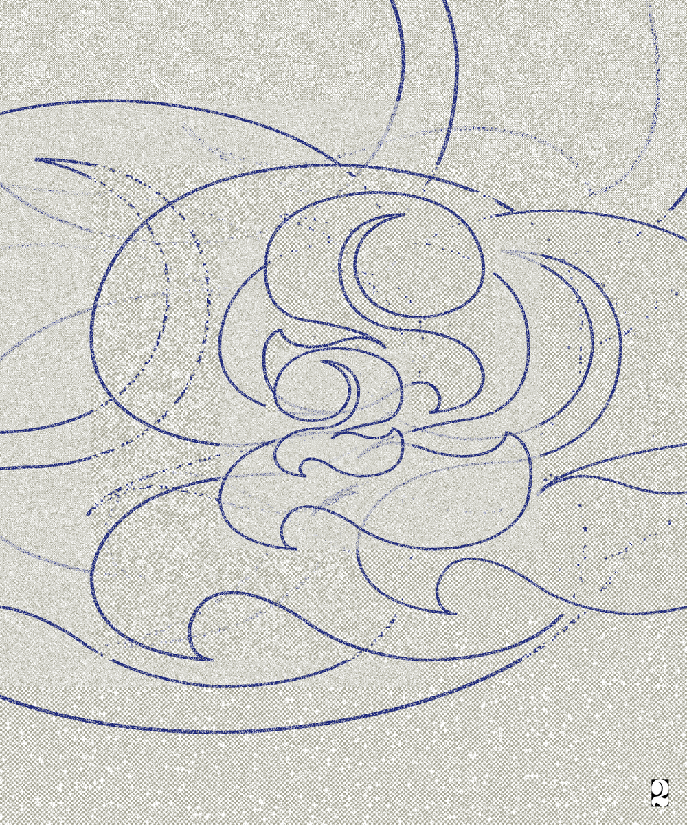
Covenant #20 (left) Covenant #35 (right)
Paloma: In what ways do you feel your work continues the tradition of celebrating text as both a visual and communicative art form?
Emily: In such a rich category, I am especially interested in how text art allows for the exploration of iterative processes, plays with the tension of illegibility, and creates a nuanced relationship of form and function.
I work to push these themes forward by inventing new aesthetics of typography and exploring how they lend themselves to the very human desire to read, or find meaning.
Paloma: What is your hope for the viewer of this work? What might be some takeaways or aspirations you have for this series moving forward?
Emily: This series is very special to me. I’ve been with it for a long time, and its process has shown me a new side of myself. I hope viewers feel both the earnestness and playfulness I gave the pieces, the titles, and the traits. I hope they feel the passion I put into them and their connection to the rich traditions of text, ornament, and pixel art.
I want to explore what else I can do with the drawing tool, and find out what others might do with it, too.
See Emily’s full collection on SuperRare here.